When it came time to redesign the Accordance 10 interface, we were determined that there would be no “sacred cows” we would be unwilling to sacrifice. On the other hand, we were equally determined that we would not engage in unnecessary slaughter: that is, we saw no point in change merely for the sake of change. In every design decision, we tried to simplify, declutter, and beautify, while being careful not to fix what wasn’t broken or to lose Accordance’s distinct advantages.
One example of this can be found in the redesign of the Search tab. There were some previously sacred cows we sacrificed, but without sacrificing the benefits those elements were designed to provide.
One such sacred cow was the search button: the button to the right of the search entry field which you could click to perform a search. Accordance has always let you hit Enter or Return to perform a search rather than clicking the button, so the button has always been a bit superfluous. Such buttons were an interface standard when Accordance began, but over time they have disappeared, and new computer users simply know to hit the Return key.
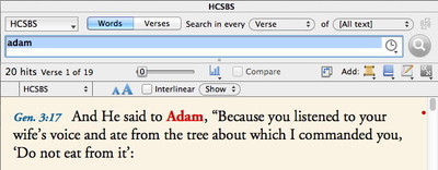
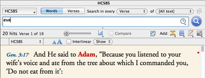
Yet while the search button had fallen out of interface fashion, it still served a valuable function: its state offered visual feedback that you had actually performed the search. Once you clicked that button or hit Return, the button would become grayed out, and you would know that the results you saw in the display pane matched what you had entered in the search field. Once you made a change in the search entry, the button would become undimmed to indicate that you had not yet performed this new search.
We retained that button for as long as we did because we felt the visual feedback it provided was important. For Accordance 10, we decided it was time for that “sacred cow” to be sacrificed, but we still wanted a way to offer visual feedback with respect to whether a search had been performed. Eventually we decided to dim the actual words you enter rather than a separate button. So whenever the contents of the search field are changed, the text appears black. Whenever you hit Return, the text becomes gray. In this way, we removed the clutter of an extra button, while offering even stronger visual feedback than that button provided.
Another sacred cow we sacrificed was the need to enter an asterisk when searching by verses to display the entire text. This was an interface convention we had had since Accordance 1.0, and believe it or not, there really was a logical reason for it. Nevertheless, it was a requirement new users often found confusing, so we sacrificed it. Now any blank search will display all verses. Entering an asterisk with Verses selected will still work, but there is no longer any need to learn that little idiosyncrasy.
By taking a hard look at every aspect of the interface, including many that had been around since the very beginning, we significantly simplified Accordance for new users, and streamlined it for existing users. Yet we did so in a way that avoided sacrificing important functionality or visual feedback. So far, both new users and old hands have been enthusiastic about the changes.


