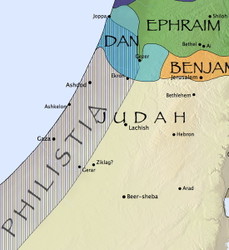
Last week, I showed how the Accordance Bible Atlas lets you create custom maps that show information you won’t normally find in a print atlas or a software program that offers only static maps. The final map I showed combined several layers of information, and a user pointed out that there were some places where the labels overlapped. So I followed up that post by showing how tweaking one of the Site layers eliminated all but one of the label conflicts. In yesterday’s post, I showed how to eliminate that last conflict by removing one of the subregions of a Region Layer. But even that wasn’t quite good enough, because the labels for Philistia and Judah, while not quite overlapping, are still unacceptably close.
Unlike the label for Simeon, which I could simply hide, these two labels are a vital part of what I’m trying to show with this map. So how do I resolve the conflict? The easiest way is simply to change the font.
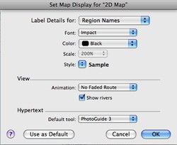
You can change the font of all Region names on a map by selecting Set Map Display from the Display menu (or using the keyboard shortcut command-T). In the dialog box that appears, select Region names from the pop-up menu at the top.
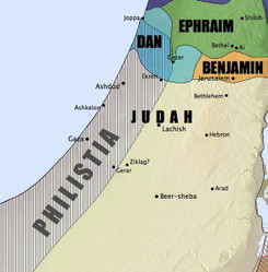
You can then select a font that avoids the conflict. The font I was using, Papyrus, takes up a lot of horizontal space, but a font like Impact is more horizontally compact. And of course, using a different font can also give your map a radically different feel:
Once again, a simple change can make a huge difference in the look of your maps. And I’ve just scratched the surface of the flexibility the Atlas offers. There’s still more which I’ll cover in yet another post.


